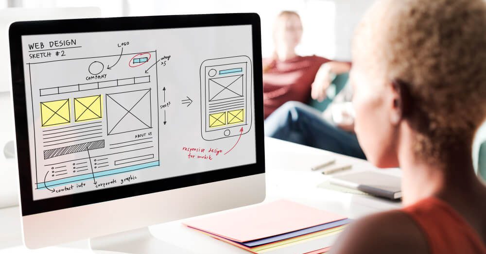
8 Basic Principles Of Web Design
Successful web design is not about a pretty picture, but about practicality. The main site will always be the user, as he studies the information and makes decisions.
Accordingly, you need to create all the conditions for a comfortable stay on the page. Achieving such success depends on adhering to the principles of web design.
The simplification of the perception of the content offered by the site depends on this. User orientation means understanding their actions.
Therefore, before studying the principles, I want to draw your attention to the line of behavior of users when surfing the Internet.
Psychology of website users
Human actions are aimed at achieving results in the shortest possible time. Of course, this also applies to visiting web pages. User behavior is a lot like visiting a store. He clearly knows why he came, and therefore goes to specific points.
At the same time, the user wants to find them as quickly as possible. In the absence of a specific goal, they are looking for something interesting. Because surfing is very fast, which means that there is a small fraction of time to attract attention.
The user loves the quality. The layout of the sections, the size of the fonts, the clarity of the images – all this quickly catches the eye. One mistake in a word or a blurry picture quickly scares off and provokes you to press the “Back” button.
The user is scanning. The buyer does not go around all the shelves to find the goods: he focuses on the “anchors” (the biscuit department, the vegetable department, etc.).
Likewise, the user of the site quickly navigates through the key points of the site in search of necessary or interesting information. As already mentioned, he wants to get what he wants in a short period of time.
The user does not tolerate. Surfing the Internet should be relaxing. If a web page forces you to understand the material or search for a key point for a long time, the user goes to another site. Users rely on intuition.
Almost always, visitors browse services rather than read all the material. For example, the “Spotlight” section should contain the latest news or key events, rather than the benefits of working with the service.
Neglecting this detail will confuse the visitor. The user loves control. When moving to the next section, no one expects pop-ups or ads. After all, they lead to additional clicks, which are very annoying.
The site visitor makes decisions and wants to get the result right away, and not deal with the wrong linking.
1. Eliminate thought processes
The website should not raise any questions. When exploring the page, the user does not have to think “What if I click here?”: The button, picture or text should contain a ready-made answer. Complex structure and navigation cause a lot of problems.
It is simply difficult for the user to understand the system and reach the final goal. Properly named sections, visible cues, and a clear layout of the main elements will help you quickly navigate between pages.
A prime example of a good site structure is online stores like Zaful. The user clearly understands where to go to buy a shirt or blouse.
It can quickly reach the goal (ordering goods), since the necessary buttons are located at the top of the screen, which eliminates the need to scroll the page. The paradox of choice.
Many people think that we go to the store, where there is a wider selection of goods.
In fact, we buy things where the choice corresponds to our desires. More variety is more intimidating. Confirmation of this is the experiment of Sheena Iyengar and Mark Lepper.
They gave the participants two tables: one with 24 types of jam, the other with only 6. A greater desire to buy something appeared in the second version.
When a person sees a lot of information, he gets tired and does not want to decide anything, which means he does not want to act.
The page should lead to a minimum of actions. The client will be able to quickly move between sections and not get tired of the content. Moreover, it eliminates a lot of distractions and simplifies the appearance of the site.
Therefore, it is much easier to deal with its structure, which means that the goal will be achieved faster.
2. Content layout
When scanning a page, the user always focuses on key points on the screen. They do not depend on the information itself, but on the location of its placement.
There is a “rule of thirds” in photography, according to which the image must be divided into 9 equal parts. This is how 4 points of power are formed, to which the main attention is riveted.
What should be placed in one of these points on the site? Call to action. Go to any marketplace and notice the design that the offer to get started or the purchase is always located in one of these four points.
At the same time, navigation bars cannot be placed at intersections. After all, it encourages not to action, but to the transition to another page, which still needs to be dealt with.
Perhaps the user will get what they want, but the owner of the site is unlikely.
Website design uses the F-model. We are used to studying information from left to right and from bottom to top. Therefore, the most important elements should be placed in the appropriate parts of the screen.
Most often, the name of the service is located in the upper left part of the screen, and the registration button is located in the upper right part. This is what the owner of the service should focus on. It almost never reaches the lower right side.
As a rule, advertising banners, comments or empty space are placed there.
3. Nerves are not steel
We are all impatient by nature. This is especially true of surfing the Internet, where among the endless content you want to quickly find what you want.
The fewer clicks a visitor needs to achieve a result, the greater the chance that he will try the service itself in action. First of all, take care of the loading speed of each page.
Aberdeen Group conducted a study that showed that a second delay reduces conversions by 7%. To find out the download speed on the site, you can use the following services:
- – Google PageSpeed Insights;
- – GTmetrix;
- – Sucuri Loadtime Tester.
Also, don’t force visitors to enter any data right away. Moreover, leave only the e-mail and password required for registration. When visiting a site for the first time, the user wants to experience it, not to disclose their data.
Ideally, first show how your service works, and then call to action. The user must understand why he “gives e-mail”. In other words, he knows why he is wasting his time filling out all the forms.
4. Minimalism
Today it is a trend in all areas, from the interior of the room to photography. Web design is no exception. There are two concepts: positive and negative space. The first characterizes the part of the page that contains any information.
The second is an empty space, a white space. Many are afraid to leave empty space on the pages. People think that this creates an impression of incompleteness. But this is a huge mistake, due to which many sites become unreadable.
The web design of the Apple site in this regard can be considered a reference. There is always a minimum of information on the screen, but it is enough to answer all questions and call to action.
In many ways, its design is similar to the presentation of some product of this company. There is always a big picture and one or two sentences or a list on the screen.
When visiting a page, the user conditionally divides the page according to the priority and importance of the information. This makes it easier for him to perceive the content and make a decision.
That is why you can get acquainted with the next gadget from Apple in a matter of minutes. Very often flat design is used for these purposes. A few tips for the correct use of white space:
- – Large font – smaller spacing between letters and vice versa.
- – One and a half line height (150% of font size). When using small fonts, this setting should be higher.
- – Divide information into small blocks.
- – Navigation bar, headings or slogans should be in capital letters.
- – There should always be plenty of space between them as they are key elements of the site.
5. Color range
Color is one of the most important elements of marketing. Fast food establishments often use more vibrant and trendy colors that quickly put pressure on the eye. So the visitor subconsciously leaves faster, which increases the flow of customers.
On the contrary, expensive restaurants have pastel colors that create a feeling of peace.
However, choosing a shade is only a small part of the success. A more important element is the combination of different colors and gradients in web design. Go back to Apple’s site: it’s predominantly dark. However, they fit perfectly together.
The text blocks and the navigation bar are completely white.
Adobe’s Color Wheel is the perfect companion. When choosing one shade, the service automatically selects 4 suitable colors. You can also take a high-quality photo or picture that you can admire for hours and upload it to the service.
Based on the available colors, an appropriate gamut will be created. Important elements of the site should always be contrasting (for example, white text on a black background).
So they will attract more attention, which means they will leave the user on the site.
6. Rule of 8 seconds
One of the principles of psychology is to make a strong first impression on a person in order to win his attention. This is fully applicable to web design. Only in this case there is no room for error.
If the user is not interested in 8 seconds, he will leave the site and will not return. How to get attention in 8 seconds?
- – use concise, catchy headings;
- – explain the purpose of the project on the main screen;
- – add relevant video and images;
- – animate call to action buttons;
- – avoid ads on the main page.
7. Stick to tradition
For many sites, there are several traditions in their design. For example, today a lot of sites have registration and authorization buttons in the upper right corner. The navigation bar is usually located at the top and is highlighted in white.
We are accustomed to such elements and subconsciously look for them in their places. Such traditions should not be changed. Because of this, no one will call the site monotonous, template or boring.
On the contrary, the user will be glad that the key elements are in place.
8. Don't skimp on testing
The best products in the world have passed many tests. But most of them were carried out in the early stages of product development. Moreover, almost all tests were carried out several times.
Only in this way can all inaccuracies be detected and corrected.
– Test each design element several times.
– Find an independent test assistant.
– Conduct repeated tests.
You need to check web design both at the first stages of creation and before launch. Only in this case it is possible to achieve maximum efficiency and create a high-quality project.
Search Blog
Categories
- Analytics(16)
- Android Development(1)
- Apps development(1)
- Branding(30)
- Branding solution(20)
- Business(20)
- Design(10)
- Design and creative(13)
- Digital solution(12)
- Facebook(4)
- Google Ads(6)
- Graphics(7)
- Instagram(8)
- Marketing research(15)
- Marketing solution(18)
- Marketing strategy(21)
- PPC(7)
- SEO(10)
- SMM(16)
- Social media marketing(10)
- TikTok(5)
- Uncategorized(7)
- Video content(4)
- Video production(4)
- Web Design(4)
- Web Development(6)
- YouTube(3)
Categories
- Branding solution (2)
- Brand identity
- Brandbook
- Design and creative (2)
- Graphic design
- Illustration
- Marketing solution (4)
- Marketing
- Marketing research
- Marketing strategy
- Mystery shopping
- Didgital solution(4)
- Google, Facebook ADS
- Search Engine Optimisation
- Website development
- Digital marketing
- Social media marketing(5)
- Facebook marketing
- Instagram marketing
- LinkedIn marketing
- Complex SMM
- TikTok Marketing
- Video production(4)
- Short video production
- Video animation
- Video presentation
- YouTube Marketing
Our Top Articles
Recent Posts
- Working with Negativity on Social Media October 3, 2023
- The Difference Between Rebranding and Redesign October 2, 2023
- Font Marketing Development: The Power of Typography in Branding and Design September 28, 2023
- Price Positioning in Design September 26, 2023
- The Formula of Successful Positioning September 25, 2023
Popular Tags
Advertising Analytics Artificial intelligence brand Brand book Brand identity Brand management Brand platform Brand positioning Brand recognition Brand visibility Content marketing Customer Journey Map Customer segmentation Digital advertising Digital marketing Facebook Google Ads Graphic design Influencer marketing Instagram Instagram post Landing page Logo design Marketing Marketing agency Marketing efficiency Marketing funnel Marketing strategy Native advertising Pack design PPC Reels SEO Short videos SMM Social Media Social Media Marketing SWOT analysis Target audience TikTok Tone of voice Website Website development YouTube